Ceramics trends for the remainder of 2018 and 2019 follow the path they started during last year’s fairs: risky products where colour and decoration once again have found their place.
On the one hand, all the designs stand out, whether in small or large format, where the material is the protagonist: marbles, granites, large veined stones, mottled stone…
On the other hand, ceramics continue to gain ground as an interior design element protagonist through tiles that line up with the latest decorative trends. The mid-century style or the new Art Deco that have been protagonists in the latest design trends in Europe find their ceramic responses in the latest trends.
One of the relevant issues is that is that the ceramic design is increasingly conditioned by the space.
The formats and finishes are no longer standardized, but rather search for concrete solutions for each project, whether it be a bathroom, a kitchen, a hotel, or a restaurant.
The ability of the collections to respond more efficiently to the needs of the space and the aesthetic requirements of the client is essential to generating a successful design.
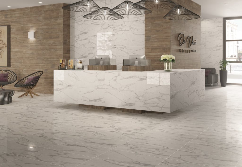
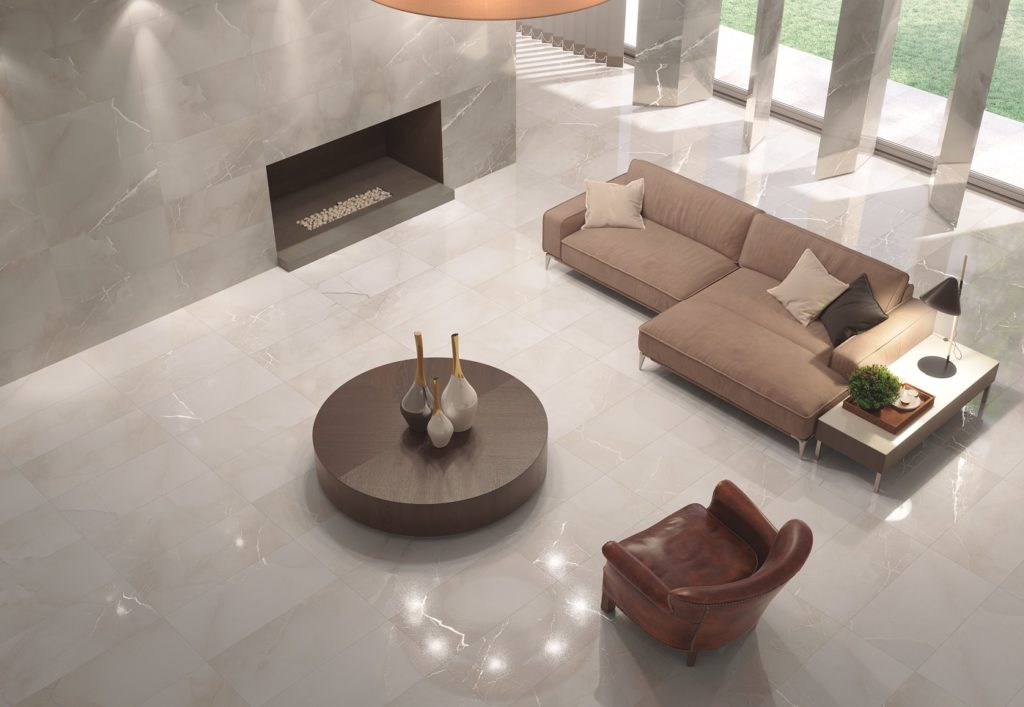
LIGHT MARBLED
This trend is characterized by a series of mottled surfaces and subtle veins that give it a clearly material nuance in which the product becomes the plot line of the space.
As a reaction to the minimalism of recent years, we see how these surfaces replete with elements, far from hiding the product, expose it and highlight its materiality.
The mottled stone, the subtle veining, the grains, and the designs that are inspired by geological strata are the real protagonists.
 Sweethome.
TILE DECÓ
The Tile Decó trend looks back to revive some classics from previous decades with a renewed look.
Art Nouveau and Art Deco from the ‘20s and ‘30s, as well as the English Arts & Crafts movement, stand out with special relevance.
Its main characteristics are sophisticated and elegant proposals with a baroque touch in a contemporary key.
In general, within this trend there is a taste for ornate decorations, where the mixture of different materials becomes a great creative resource.
We come across very elaborate surfaces that are full of detail.
The decorations play with the fragmentation of large, geometric blocks that are also transferred to coatings executed in the classic black and white, but that also explore more contemporary territories where colour becomes more important.
 Passion. Relieve Twin.
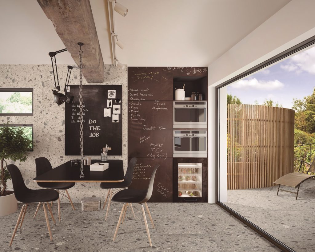
DARK & WATERCOLOR
This trend moves away from the perfected surfaces of past seasons in favour of raw materials. Earth, dust, slates, and worn metals are used as references.
There is a predominance of dark and cold tones with a lot of use of black, greys, and blues. It uses scratched surfaces, even achieving the effect of erosion or abrasion.
Ceramic finds a field to develop textures with worn surfaces that suffer through the passage of time.
 Creative.
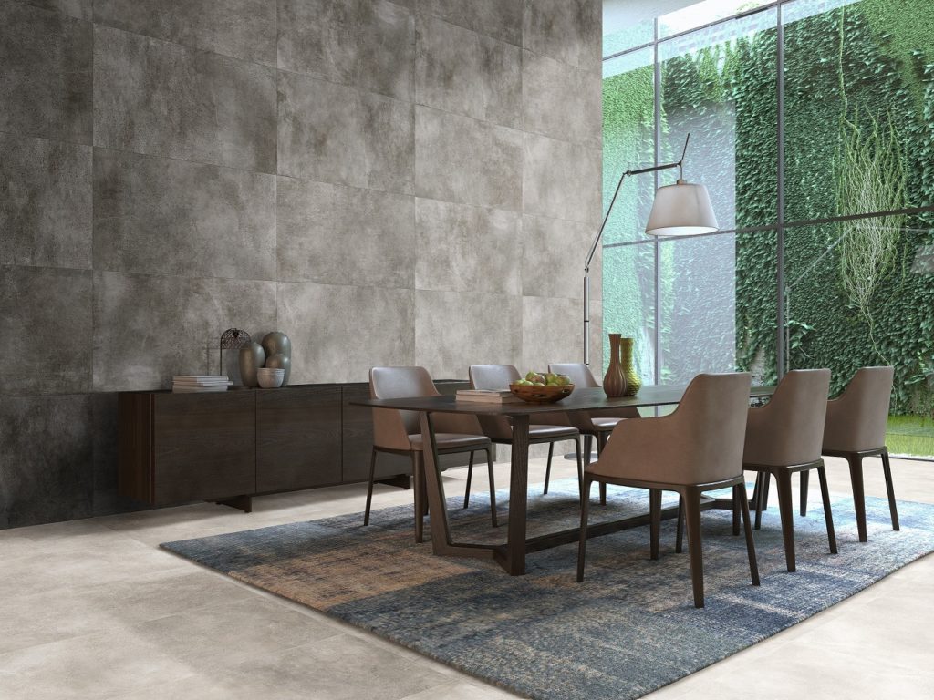
BRUTALIST STYLE
This trend reflects a certain fetishist look towards the materials and their intrinsic beauty.
It focuses on raw materials to show them at their maximum splendour: marbles, granites, cements, lava rocks—surfaces where the aesthetic qualities of the materials are celebrated.
Large formats are imposed, not only on coatings and pavements within the architectural sector, but also within the world of decoration and design.
 Da Vinci.
 Passion.
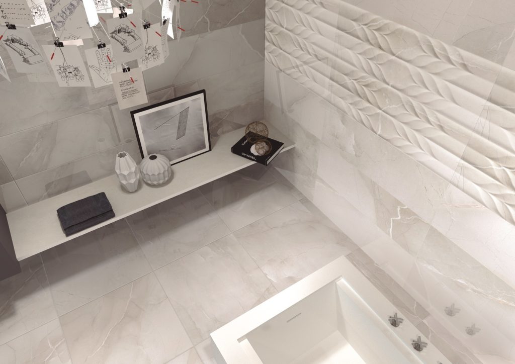
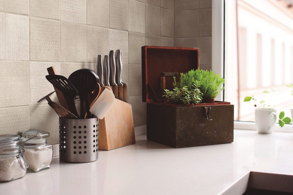
RESTORE MATERIALS
With the era of major signature architectural projects over with, now we find projects that explore a more sustainable version of architecture—practical, sober, and restrained.
The materials sector is adapted to this type of project and opts for materials with a direct relationship with the environment, highlighting the importance of textures.
Standing out are ceramic products that assert their material nature and the earth itself with simple but versatile designs destined to explore creativity through the project more than through the product.
 Wellness.
MIDCENTURY COLORS
Esta tendencia posee una clara influencia de los mercados americanos de los años 50 y 60. Colores en bloque, planos y llenos de vida, aunque con versiones más sobrias en su aplicación cerámica.
Toma el color como nota predominante para poder ofrecer ambientes armónicos, vibrantes, incluso aterciopelados.
Se aprecia menos miedo en la aplicación y combinación del color. Las tonalidades son más puras pero con presencia del negro para darles un tono más sofisticado.
Se presentan propuestas con un repertorio gráfico geométrico y lineal donde los recubrimientos están llamados a convertirse en los protagonistas del espacio.
![]() Funny.
Funny.